 |
 |
|||||||||||||||
|
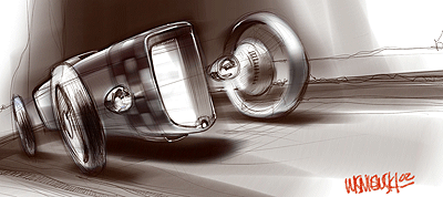
here's a sample of the work that went into the visuals for this website and some of the collateral we've offered. for example the main logo evolved like this: |
||||||||||||||||
 |
||||||||||||||||
| this was the dramatic angle we wanted to convey in the logo-power and aggression | ||||||||||||||||
 |
 |
|||||||||||||||
|
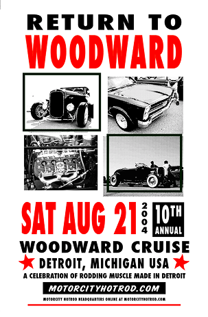
here's a quick poster done to commemorate the 10th Woodward run. if they look like an old dragway poster, it's completely intentional. they were hand screened on 100 lb stock in my garage
kinda makes you want the old Detroit Dragway back, dunnit? |
||||||||||||||||
|
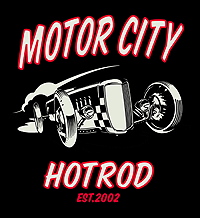
simplified, it took on a 40s comic book feel, especially reduced to one colour
the logo on black gets extra punch with some vintage hotrod red |
||||||||||||||||
 |
||||||||||||||||
|
the logo for futuristic space travel. or at least for the 2006 line of goods and products from MCHR
|
||||||||||||||||
 |
 |
|||||||||||||||
 |
||||||||||||||||
|
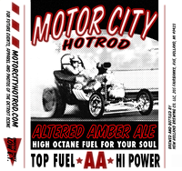
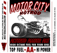
these labels were done for our annual Woodward event and the beer was not distributed or sold. Mike and I know the guys at New Holland and we ran a few cases in good fun to beat the August heat. still think it'd be fun to see these at the local watering hole, without the burnt rubber on the bottom of the bottle
|
ya gotta have a banner on the tent, so this 18x120 inch image went on grommeted vinyl courtesy of Agio graphics in Kalamazoo. the guy on Rudy's SBC '32 is Tony, whose Model A Tudor is in the locals section
|
|||||||||||||||
|
feel free to contact me at chet@motorcityhotrod.com with any questions you may have about the site or the stuff you see on these pages. thanks for settin a spell
|
||||||||||||||||
|
the goods at motorcity hotrod
|
rods and customs, local events
|
motorcity hotrod art
|
historical hotrod pages
|
Detroit and MidWest rides
|
||||||||
 |
 |
 |
 |
 |
||||||||